21 VENTUNO/ PREMIUM PACKAGING DESIGN & CORPORATE IDENTITY
The "21 / Ventuno" project involved designing and producing a custom wine bottle label for an exclusive annual corporate gifting initiative. This project required a sophisticated fusion of luxury premium packaging design and corporate identity, transforming a healthcare provider’s visual language into a celebratory, high-end token. The result is a high-perceived-value gift that reinforces brand loyalty through an elevated, tactile unboxing experience.
Project type/ Premium Packaging & Label Design, Corporate Identity
Deliverables/ Custom Wine Label, Material Specifications, Print Production Management
Date/ 2025
-
The primary objective was to bridge the gap between two disparate industries: luxury viticulture and the healthcare/supplement sector. The challenge lay in integrating the client’s highly saturated corporate identity into a sophisticated label design without it appearing pharmaceutical or garish. The design needed to communicate "natural ingredients" while maintaining a premium, boutique aesthetic suitable for high-level client appreciation.
-
As the Lead Designer, I spearheaded the corporate identity extension and technical production. My role encompassed conceptualizing the visual metaphor, managing the typography for the "Ventuno" sub-brand, and overseeing the complex print specifications—including material selection and specialty finishes—to ensure the final premium packaging design met luxury retail standards.
-
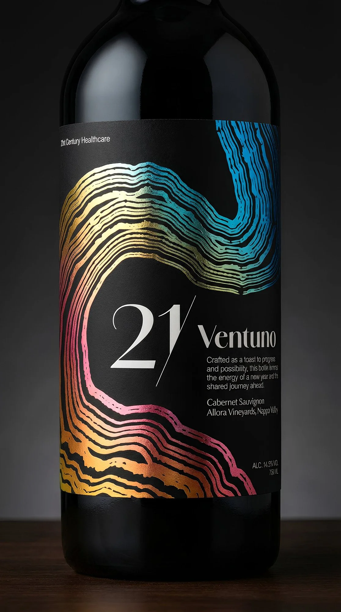
My process centered on "Visual Metaphor and Material Contrast." I developed a central motif that merged the fluidity of poured wine with the organic textures of wood grain, nodding to the natural foundations of the client’s products. To handle the vibrant corporate identity, I opted for a high-contrast strategy:
Color Engineering: Utilizing a proprietary gradient transitioning from warm magentas to cool blues.
Material Strategy: Mapping out a dual-texture finish to separate the "clinical" colors from the "luxury" wine context.
Typography: Implementing a structural, modern typeface to anchor the label design and "Progress and Possibility" messaging.
-
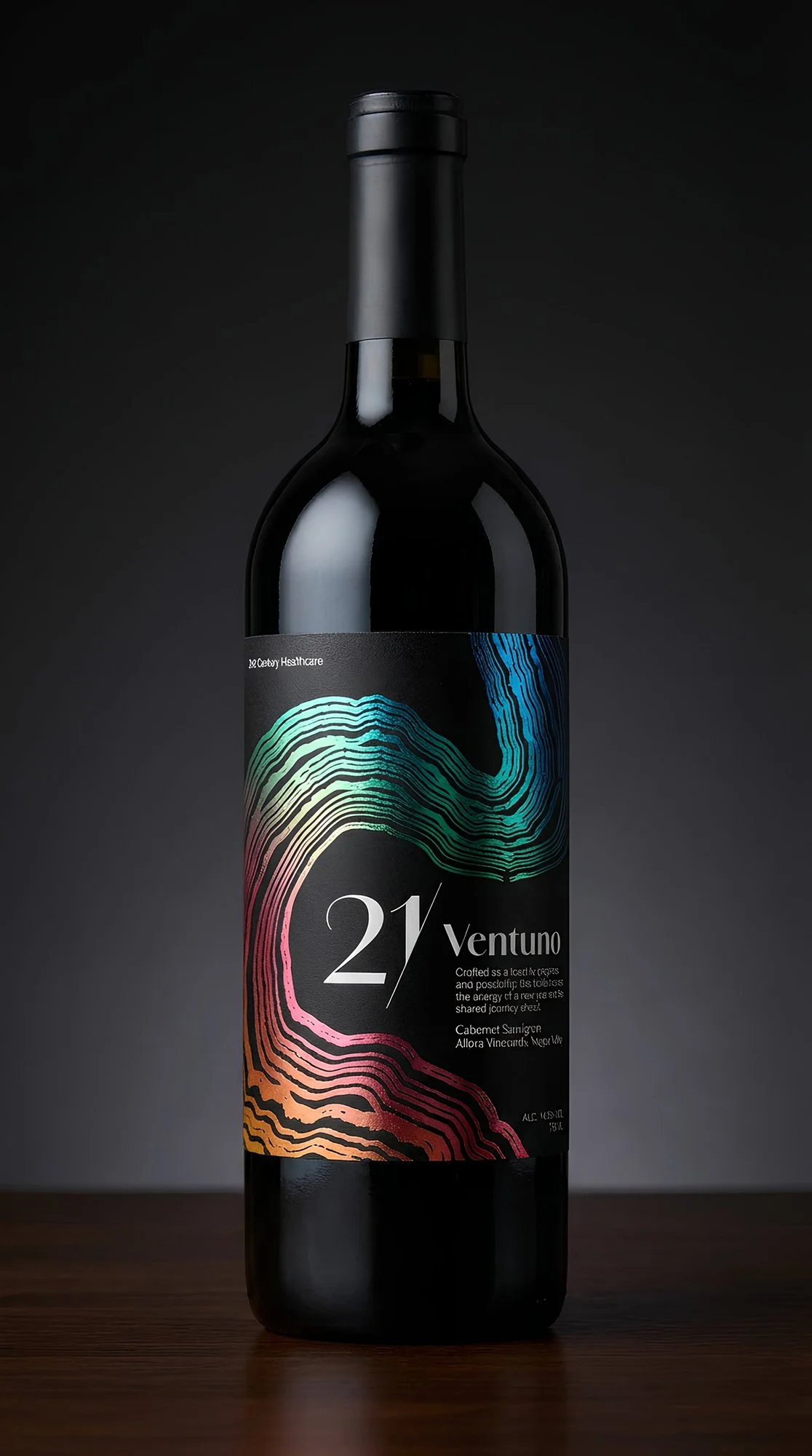
The final label design utilizes a striking abstract graphic set against a deep, matte black field. To elevate the premium packaging design, I specified a Silver Film BOPP Laminate, which gave the fluid linework a metallic, foil-like radiance. This was contrasted with a Soft Touch Laminate applied to the negative space, creating a tactile, "velvet" black background that forced the metallic gradient to serve as the dominant focal point.
-
The "21 / Ventuno" bottle transcends standard corporate collateral, functioning as a high-perceived-value brand touchpoint. By utilizing specialized premium packaging design techniques (selective soft-touch masking over metallic film), the gift successfully reinforced client relationships through a sophisticated, sensory experience. It maintained strict adherence to the corporate identity while positioning the client as a modern, design-forward leader.
-
This project was a masterclass in "The Power of Subtlety in Branding." I learned that even the loudest corporate identity can be made elegant when grounded by heavy contrast and premium textures. Successfully translating a healthcare brand into a luxury spirit reinforced my ability to adapt label design across unconventional mediums, proving that technical print knowledge is just as vital as the initial concept.
Premium custom wine bottle packaging design for corporate gifting, featuring a dark glass mockup with metallic foil gradient artwork and a soft-touch matte finish.
Close-up of the luxury custom wine label showcasing reflective silver foil detailing and colorful abstract wood grain motifs for 21st Century Healthcare.
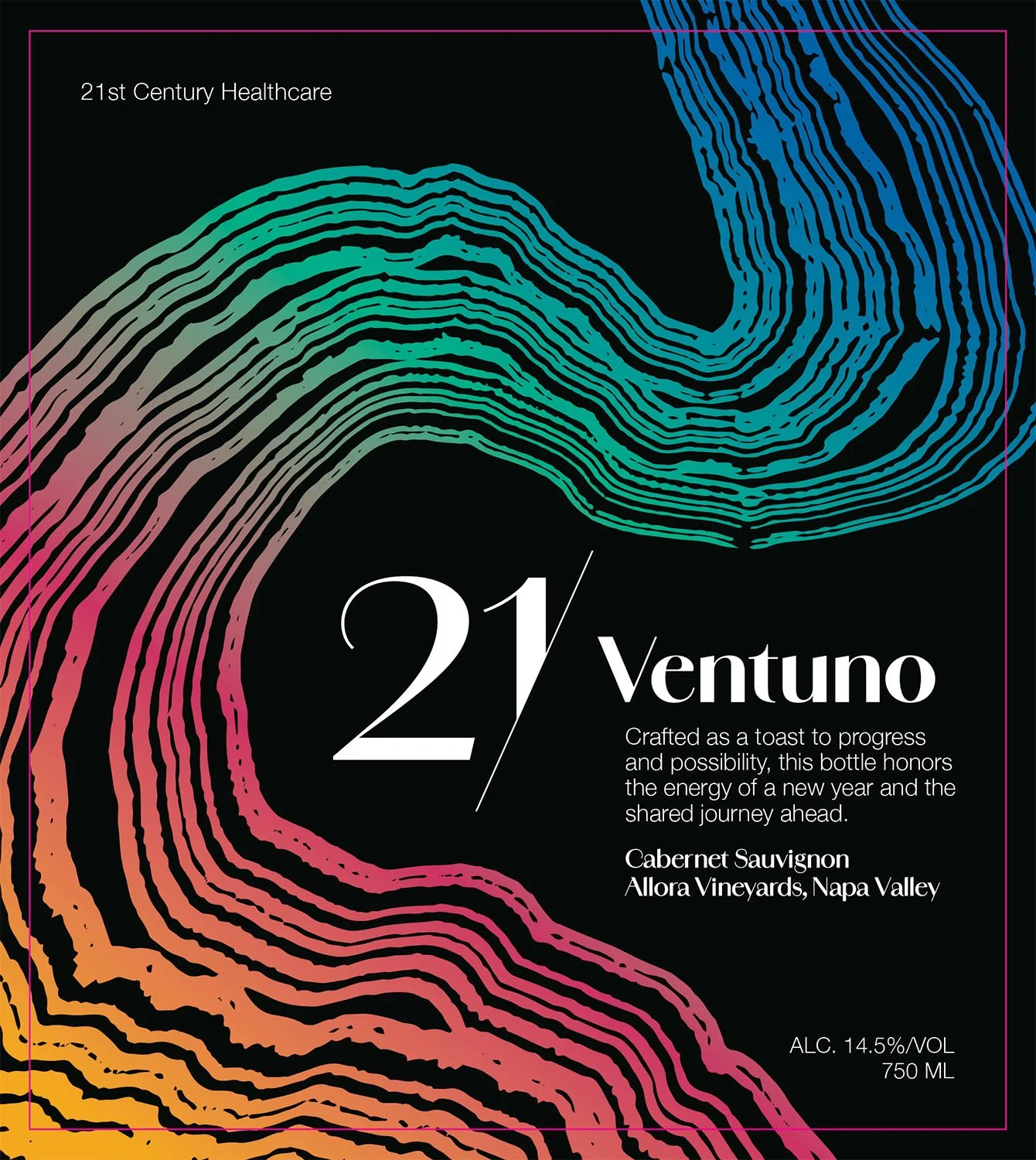
Flat digital artwork for corporate gift wine label, displaying modern typography and vibrant abstract brand color graphics on a solid black background.