OBSCURA/ DESIGNING THE ARCHITECTURE OF THE UNKNOWN
OBSCURA is a visceral descent into cosmic horror and psychological realism. Set in the rain-slicked streets of modern New Zealand, the story follows investigative journalist Howard Phillips as a mysterious manuscript, Tenebris, shatters his fragile reality. The design objective was to capture the intersection of chronic anxiety and the "architecture of oblivion" promised by a nihilistic cult.
Project type/ Book Cover Illustration & Identity Design
Deliverables/ Full Wrap Print Jacket, Digital Assets, 3D Mockups
Date/ 2026
-
The visual identity needed to bridge two worlds: the grounded, professional life of a journalist and the unraveling, existential dread of a world that no longer makes sense. The challenge lay in representing "forbidden knowledge" and a "reality unraveling at the seams" without over-relying on standard genre tropes.
-
As the Lead Designer and book author, I handled the conceptual illustration, custom typography, and the technical layout of the full-wrap jacket. I was responsible for translating the book’s core themes—obsession, the price of truth, and psychological isolation—into a commercial aesthetic.
-
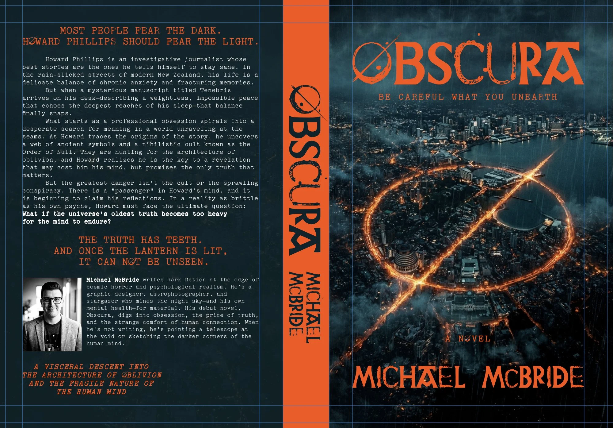
I centered the design on the concept of the "Lantern." As the book suggests, the brighter the light, the more the shadows notice you.
Atmosphere: I used a rain-swept aerial view of a coastal city to ground the story in its New Zealand setting.
Contrast: A high-contrast palette of "Warning Orange" against a deep, "Void-Teal" was chosen to trigger a sense of emergency and supernatural interference.
The Sigil: A central, glowing "mark" acts as the focal point, representing the ancient symbols and the Order of Null that Howard uncovers.
-
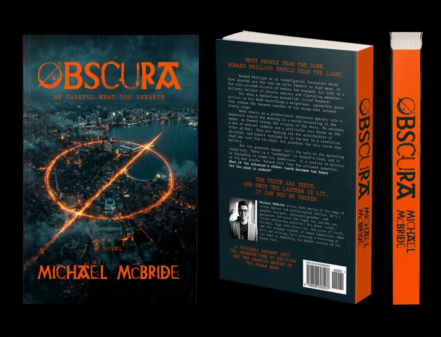
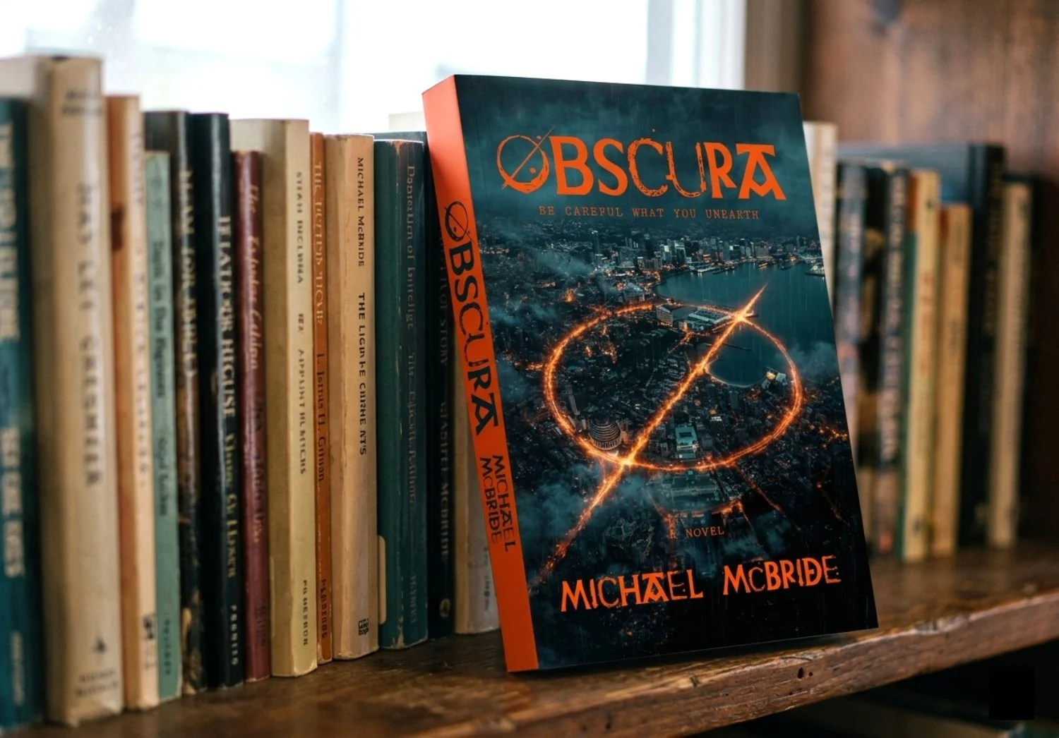
The final cover features a massive, burning sigil superimposed over the city, suggesting that the world is being "marked" or claimed.
Typography: The custom title font for OBSCURA integrates the sigil directly into the letterforms, signifying that the mystery is inseparable from the narrative.
The Spine: A solid orange spine ensures the book is an aggressive "warning" on the shelf, demanding attention among more muted thrillers.
The Back: The layout utilizes a clean, grid-like structure to reflect Howard’s journalistic background, contrasted with "disturbed" typography that echoes his fracturing memories.
-
The design establishes a high-tension brand identity for the novel's debut. By focusing on symbolic dread rather than literal monsters, the cover appeals to both fans of psychological thrillers and hardcore cosmic horror. The high-saturation colors are specifically calibrated to "pop" in digital marketplaces.
-
This project was an exploration of the quote: "The truth has teeth." The most successful element was the use of the sigil as both a literal plot point and a metaphorical "eye" gazing back at the reader. It serves as a reminder that some secrets, once unearthed, can never be buried again.