BARREL & FORGE/ AMERICAN HERITAGE & WHISKEY BRAND IDENTITY

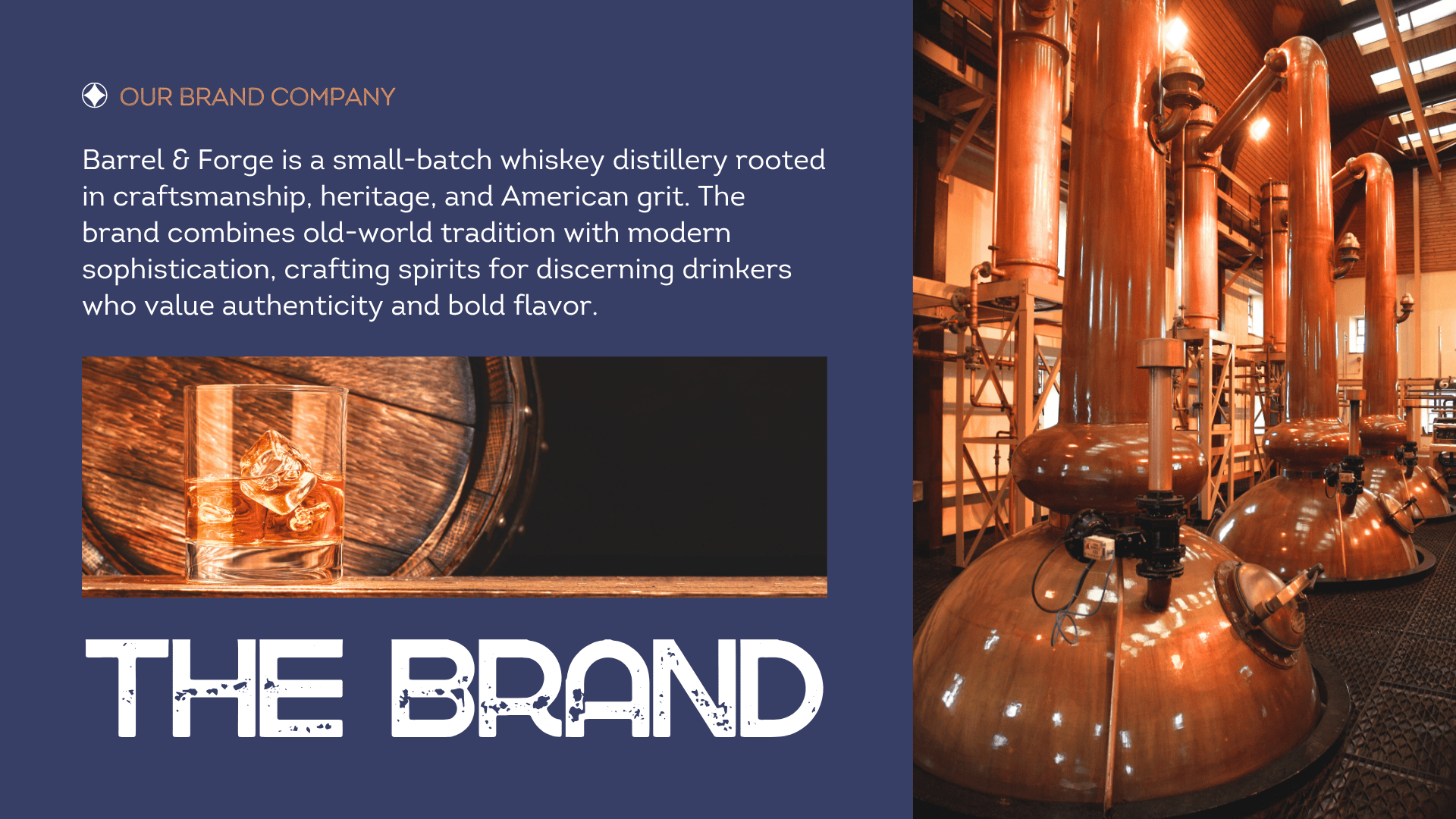
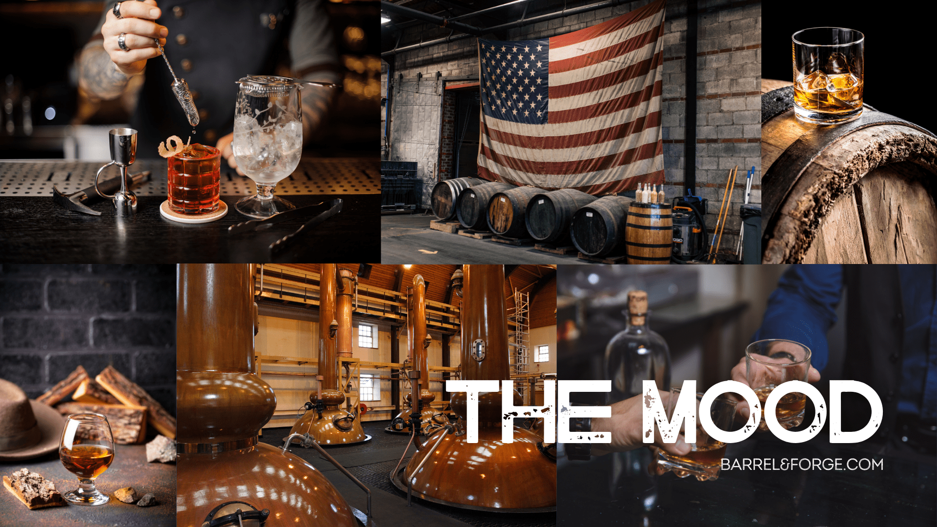
Barrel & Forge is a small-batch distillery rooted in craftsmanship and "American grit." This project involved the strategic development of a comprehensive brand design and identity, as well as a premium packaging system. By blending vintage industrialism with modern sophistication, the brand was positioned to appeal to affluent whiskey enthusiasts who value authenticity. The scope encompassed a full visual ecosystem, from custom logo marks to technical labeling for boutique retail.
Project type/ Brand Identity, Packaging Design, Visual System
Deliverables/ Logo Suite, Label Design, Typography System, Brand Guidelines
Date/ 2024
-
The craft spirits market is highly saturated, making it difficult for new entries to establish immediate authority. The objective was to create a brand design and identity that felt authentically rooted in history (Est. 1987) while maintaining the refined elegance required for premium hospitality partners. The challenge lay in balancing "rugged masculinity" with a high-end aesthetic that justifies a top-shelf price point, ensuring the packaging felt both handcrafted and professionally engineered.
-
As the Lead Designer and Art Director, I managed the end-to-end creative execution. My responsibilities included developing the heritage-driven logo suite, establishing the "Americana" textural direction, and designing the technical labeling for the "Ironclad Reserve" line. I focused on creating a scalable system where the packaging could easily adapt to future releases while maintaining a singular brand voice.
-
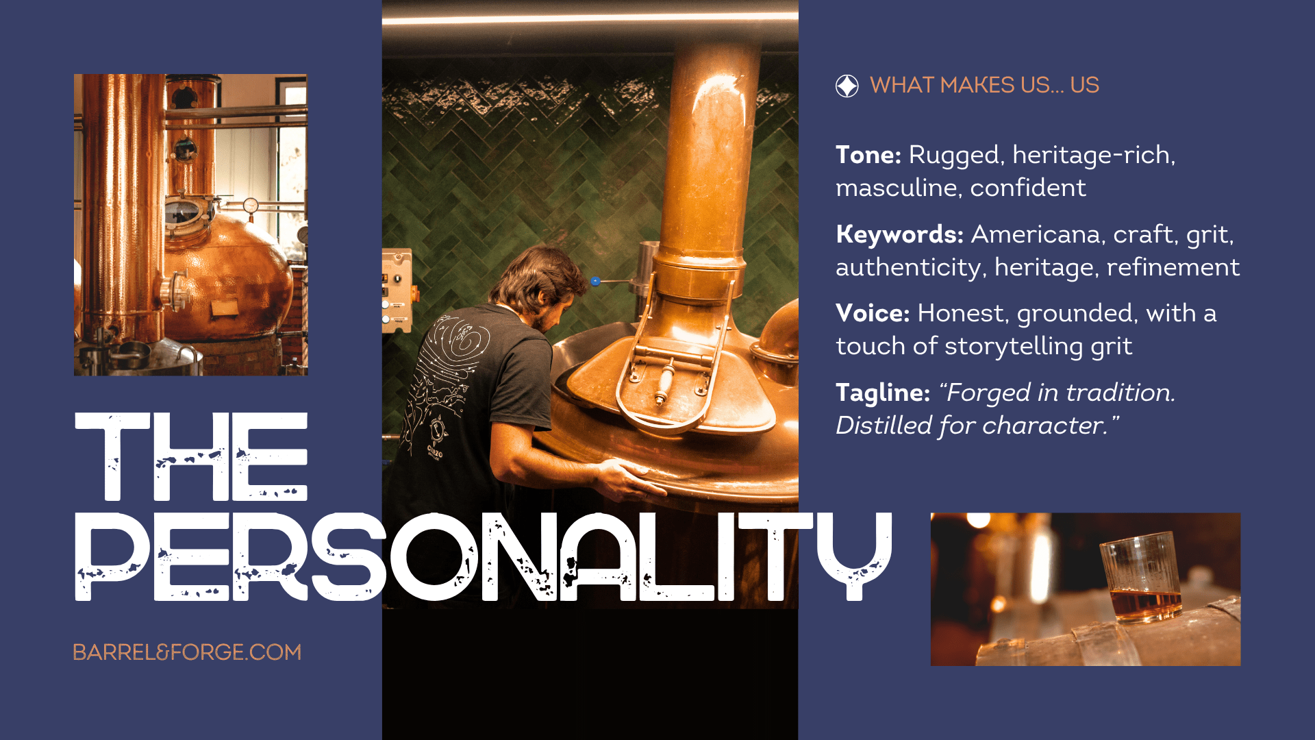
The creative strategy, "Forged in Tradition," centered on the physical labor of whiskey-making. To achieve a premium brand design and identity, I utilized a multi-sensory design approach:
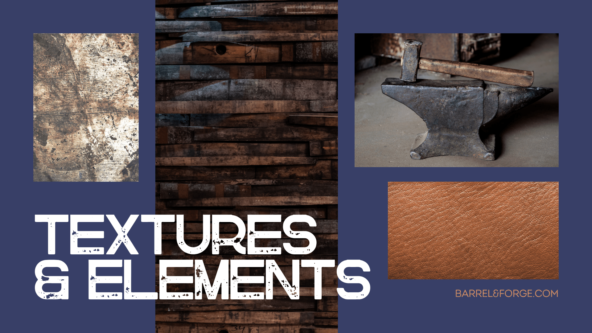
Visual Narrative: Blending distressed textures and historic engravings to evoke the heat of the forge and aged oak barrels.
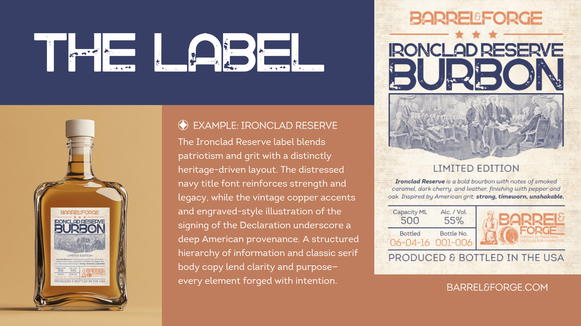
Information Architecture: Organizing vital technical data (ABV, batch numbers, volume) into a structured, classic serif hierarchy to meet industry labeling expectations.
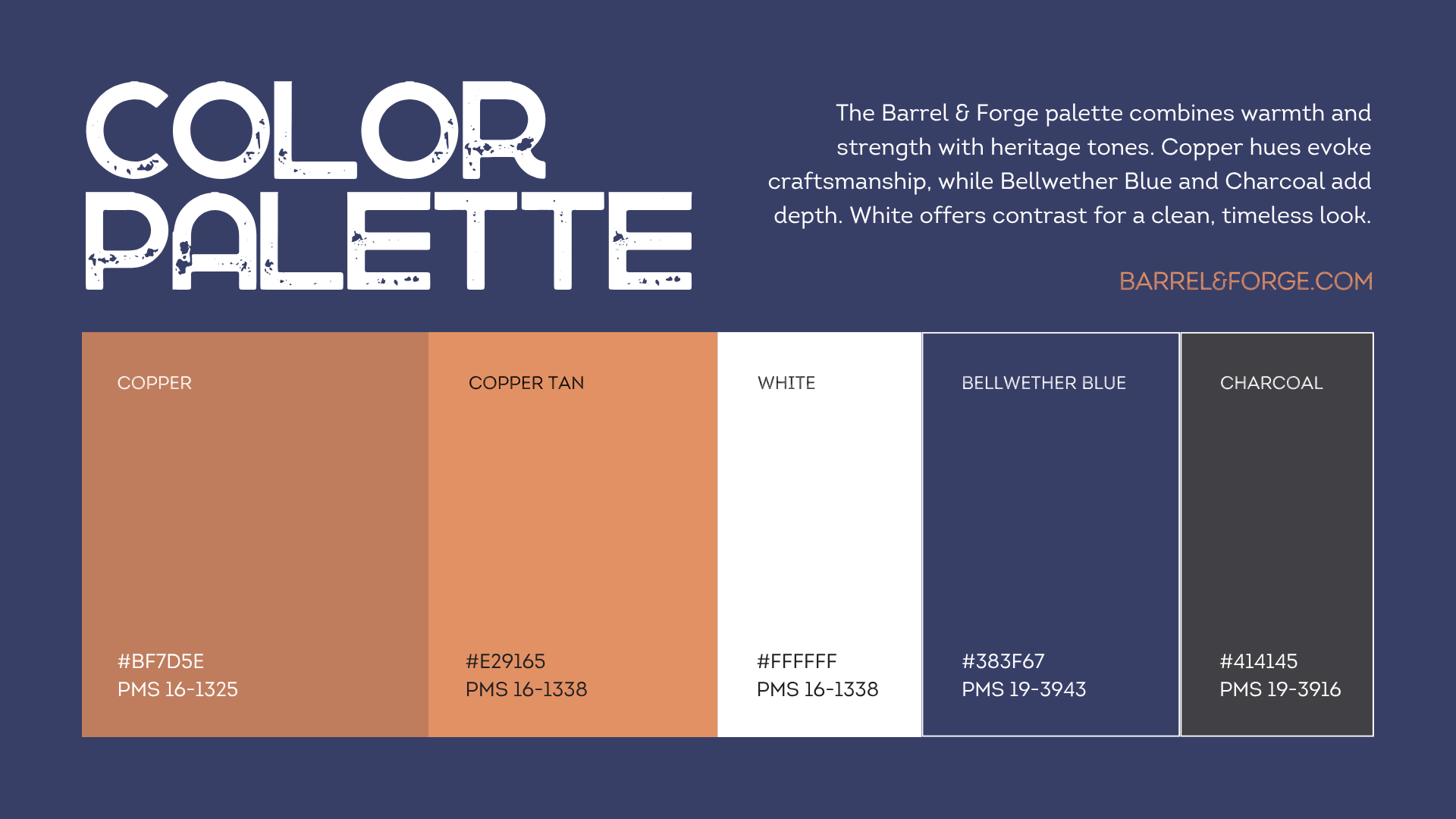
Material Selection: Specifying a textured, cream substrate and distressed navy inks to create an immediate "limited-edition" feel.
-
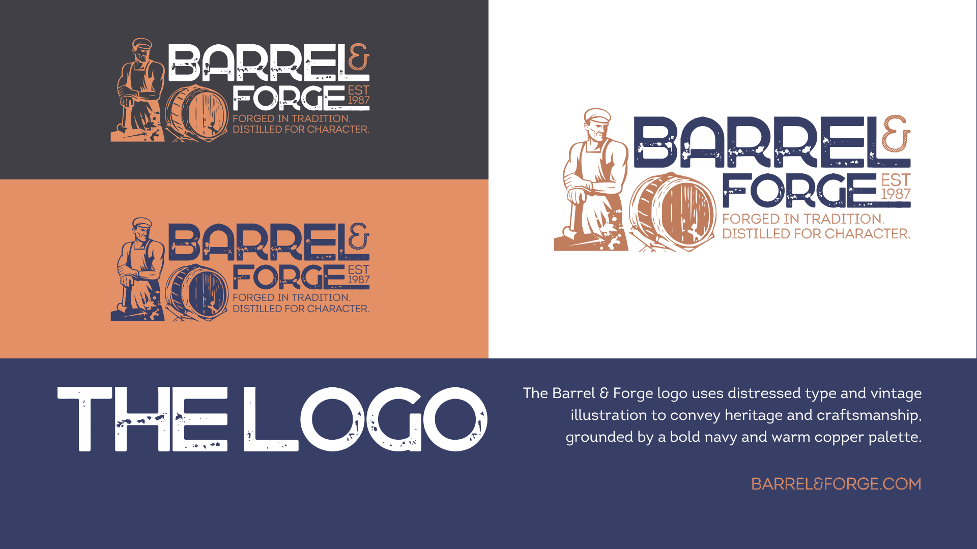
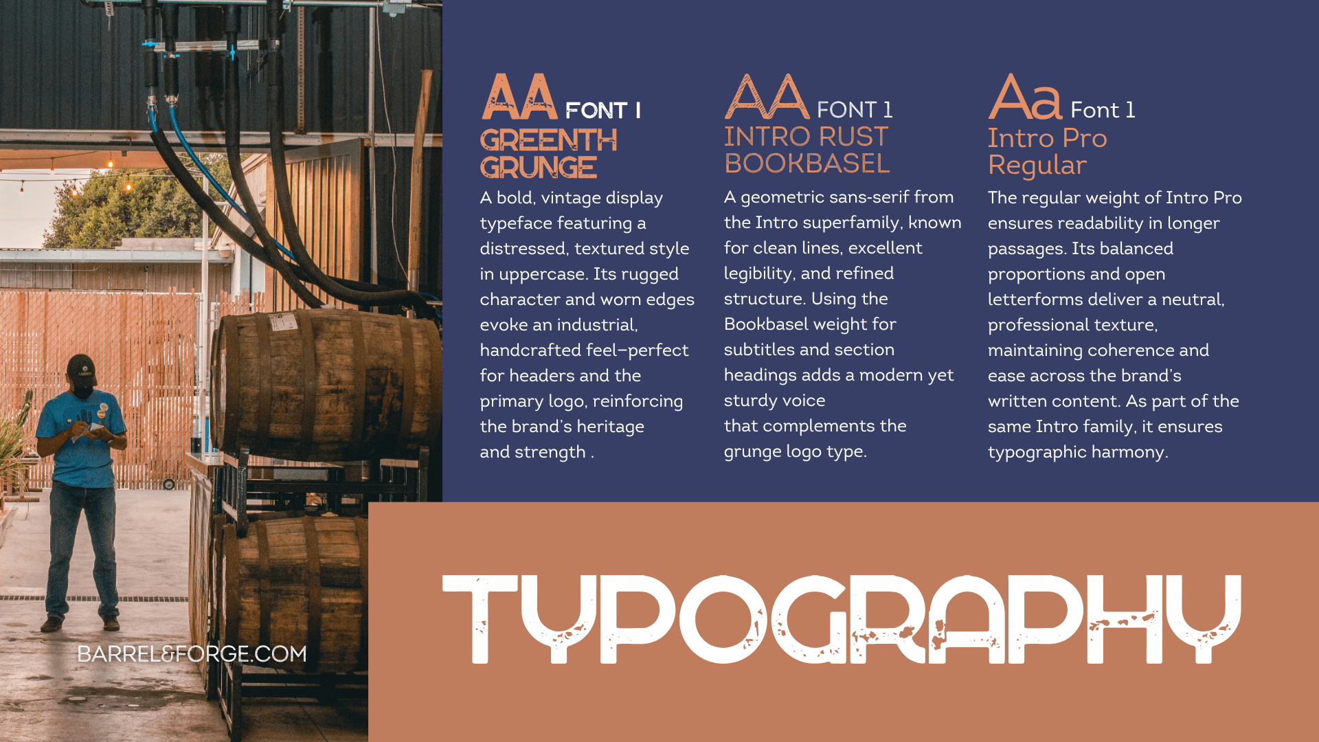
The final packaging for the "Ironclad Reserve" Bourbon serves as the brand's flagship proof of concept. The brand design and identity are anchored by the "Intro" typography superfamily, using distressed display faces for heritage appeal and clean sans-serifs for legibility. The label features a custom vintage illustration paired with a sophisticated "Bellwether Blue" and "Copper" palette, creating a high-contrast, tactile experience that stands out in a crowded retail environment.
-
The resulting identity successfully captured the essence of old-world American tradition. By delivering a comprehensive brand guideline deck, Barrel & Forge was equipped with a scalable foundation for all future marketing and product launches. The packaging and labeling successfully positioned the distillery as an honest, grounded, and premium player, ensuring long-term brand equity and consistent recognition across all consumer touchpoints.
-
This project highlighted how "Distressed Aesthetics" can still feel "Premium" when applied with a disciplined grid system. I learned that the grit of a brand's corporate identity can be its greatest strength if the labeling remains legible and structured. Balancing the raw texture of a forge with the clean lines of a boutique spirit has become a signature element of my approach to high-end packaging design.