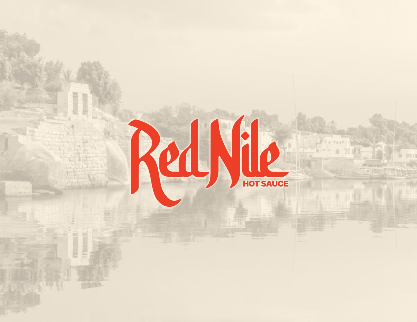
RED NILE/ BRANDING & LABEL DESIGN WITH A KICK
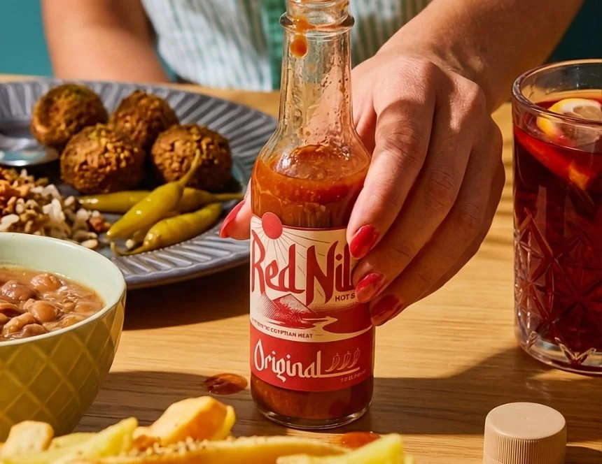
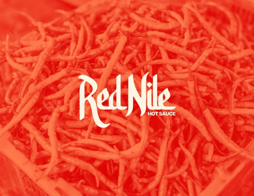
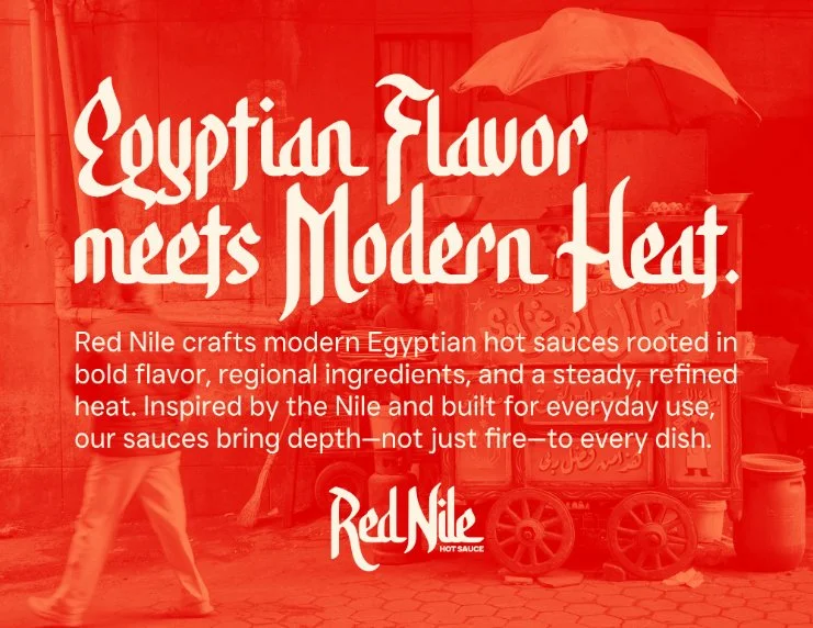
This case study outlines the brand development for Red Nile, a Phoenix-based hot sauce company that brings the complex, steady heat of Egyptian flavors to the modern table. The design focuses on a "flavor-first" philosophy, moving away from typical extreme-heat gimmicks to highlight regional ingredients like cumin, coriander, and bird's eye chilies.
Project type/ Brand Identity & Packaging Design
Deliverables/ Logo suite, custom illustrations, color systems, typography hierarchy, and label packaging for four flavor profiles
Date/ 2026
-
The hot sauce market is incredibly crowded, often relying on "shock value" or loud, aggressive branding. The goal for Red Nile was to create a visual identity that felt culturally grounded and premium. It needed to honor Egyptian heritage and the landscape of the Nile without feeling like a generic souvenir—balancing a "vintage" handcrafted feel with modern professional appeal.
-
I served as the lead designer and brand strategist, responsible for everything from the initial hand-lettered logo concepts to the technical layout of the nutrition facts and ingredient panels.
-
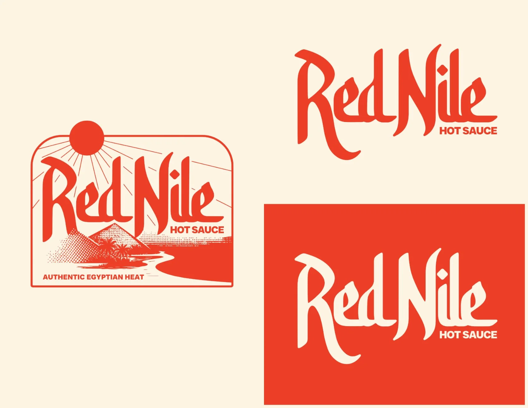
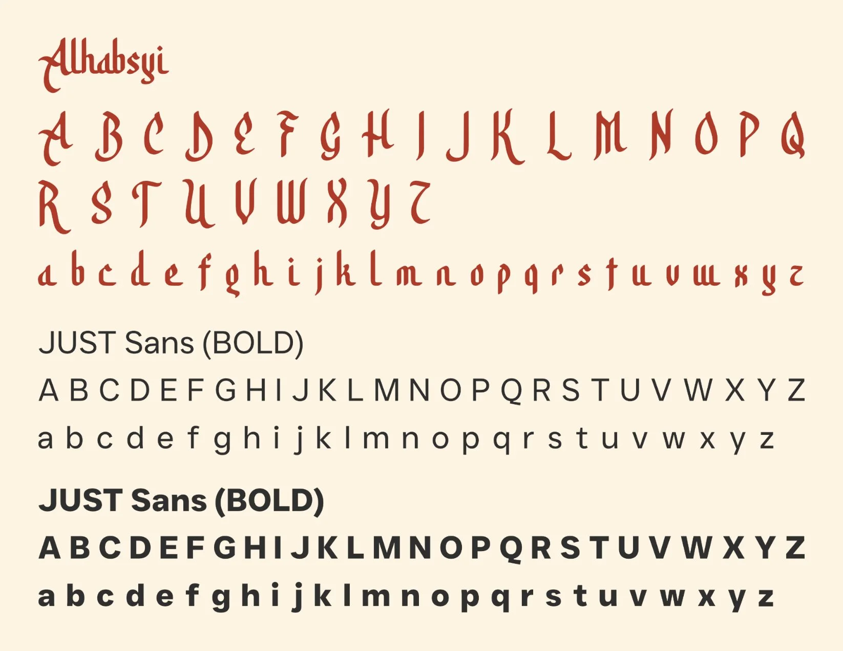
I leaned into the phrase "Egyptian Flavor meets Modern Heat" as the North Star for the project. To ground the brand in its roots, I selected the Alhabsyi typeface to provide a calligraphic, Arabic-inspired feel for the brand marks. I paired this with a desert-inspired color story—using tones like "Desert Sand" and "Saguaro Green"—to reflect both the origin of the recipes and the brand's home in Arizona.
-
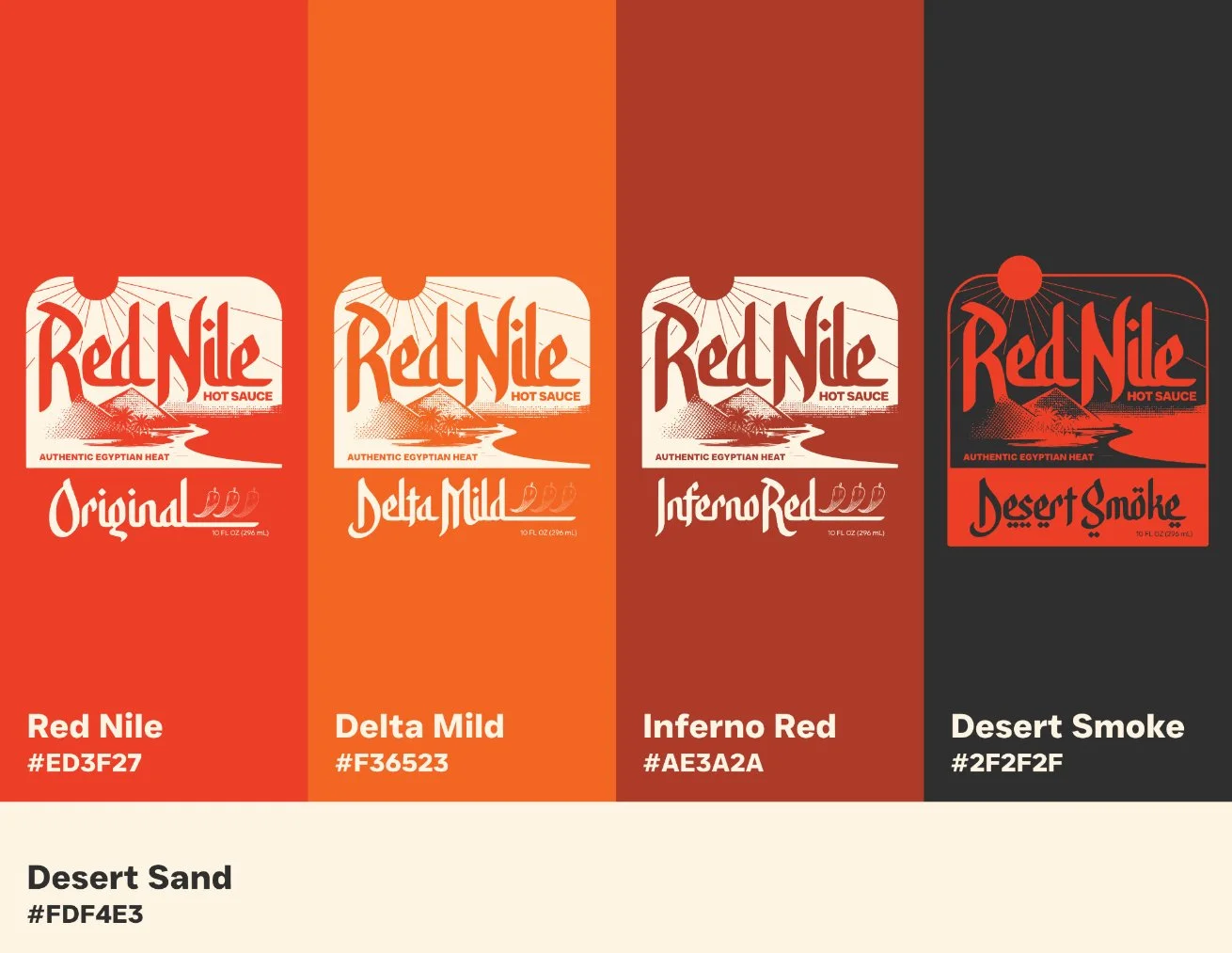
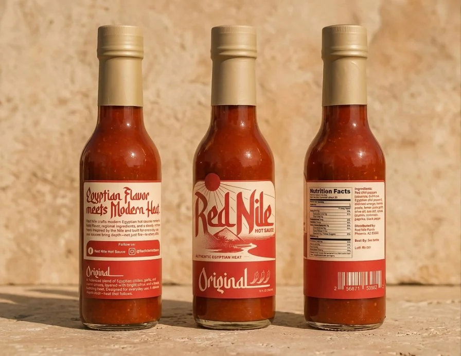
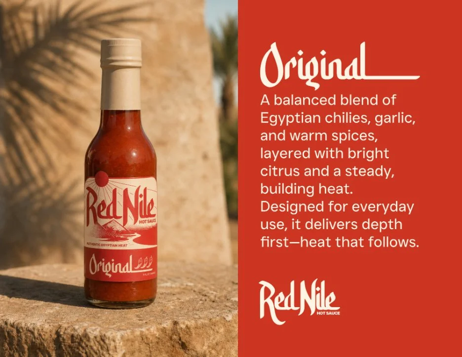
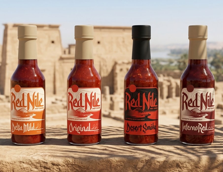
The final solution is a cohesive system that uses a tiered color approach to distinguish the heat levels of the four sauces: Original, Delta Mild, Inferno Red, and Desert Smoke.
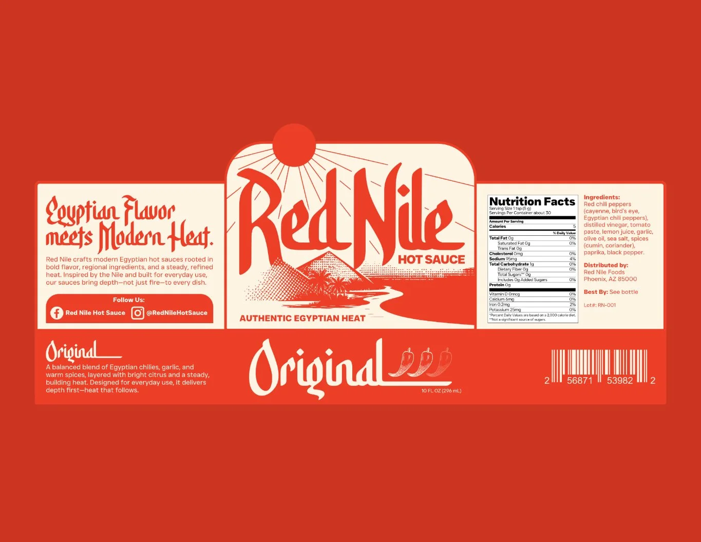
Illustration: A central "badge" design depicts the pyramids and the Nile river under a burning sun, using a textured, screen-printed aesthetic.
Typography: The use of JUST Sans for technical details ensures the labels remain clean, legible, and modern.
Information Architecture: I designed the labels with a clear grid, making it easy for consumers to find key flavor notes and heat ratings at a glance.
-
Red Nile now carries a visual presence as bold as its ingredients. The branding successfully positions the product as a "refined" pantry staple rather than a novelty item, appealing to home cooks who value depth of flavor and authentic regional heritage.
-
This project was a great lesson in the power of a limited color palette. By sticking to earthy, sun-drenched tones, we created a brand that feels like it has a long history behind it before the first bottle is even opened.