WADICRAFT/ HERITAGE SPIRITS & BOTANICAL BRAND IDENTITY
Wadicraft is a premium craft distillery concept specializing in small-batch spirits infused with native Sonoran botanicals. I developed the complete brand ecosystem—including naming, brand design and identity, and custom illustrations—to position the distillery as a sophisticated leader in the artisanal market. The project centered on a "New Southwest" aesthetic, blending rugged regional heritage with high-end packaging and technical TTB labeling standards.
Project type/ Brand Identity, Naming, Illustration, Spirits Packaging
Deliverables/ Brand Strategy, Label Design, Custom Botanical Art
Date/ 2026
-
The craft spirits industry often defaults to "Old West" clichés or hyper-minimalism. The objective was to create a brand design and identity for Wadicraft that felt deeply rooted in the Arizona landscape while maintaining upscale elegance. The challenge lay in celebrating a primary indigenous ingredient—the Prickly Pear—through a visual language that conveyed both the raw "wilderness" of the desert and the scientific precision required for professional distillery packaging.
-
As the Lead Brand Designer and Illustrator, I executed the project from initial naming to final mechanicals. My role involved crafting the brand story, hand-drawing the botanical assets, and engineering a functional packaging system. I specifically focused on the layout of mandatory elements to ensure the brand could seamlessly transition into TTB labeling compliance for commercial distribution.
-
My strategy, "Forged in the Sun, Infused by the Desert," prioritized transparency and craftsmanship. To establish a premium brand design and identity, I paired scientific-style botanical illustrations with a structured typographic grid. Key steps included:
Naming: Developing "Wadicraft" to evoke both the desert landscape (Wadi) and artisanal intentionality (Craft).
Visual Texture: Creating fine-line "botanical notes" to serve as the primary brand assets for the label design.
Regulatory Framework: Designing the information architecture to accommodate TTB labeling requirements, such as Class/Type designations, ABV, and Government Warnings, without disrupting the artisanal aesthetic.
-
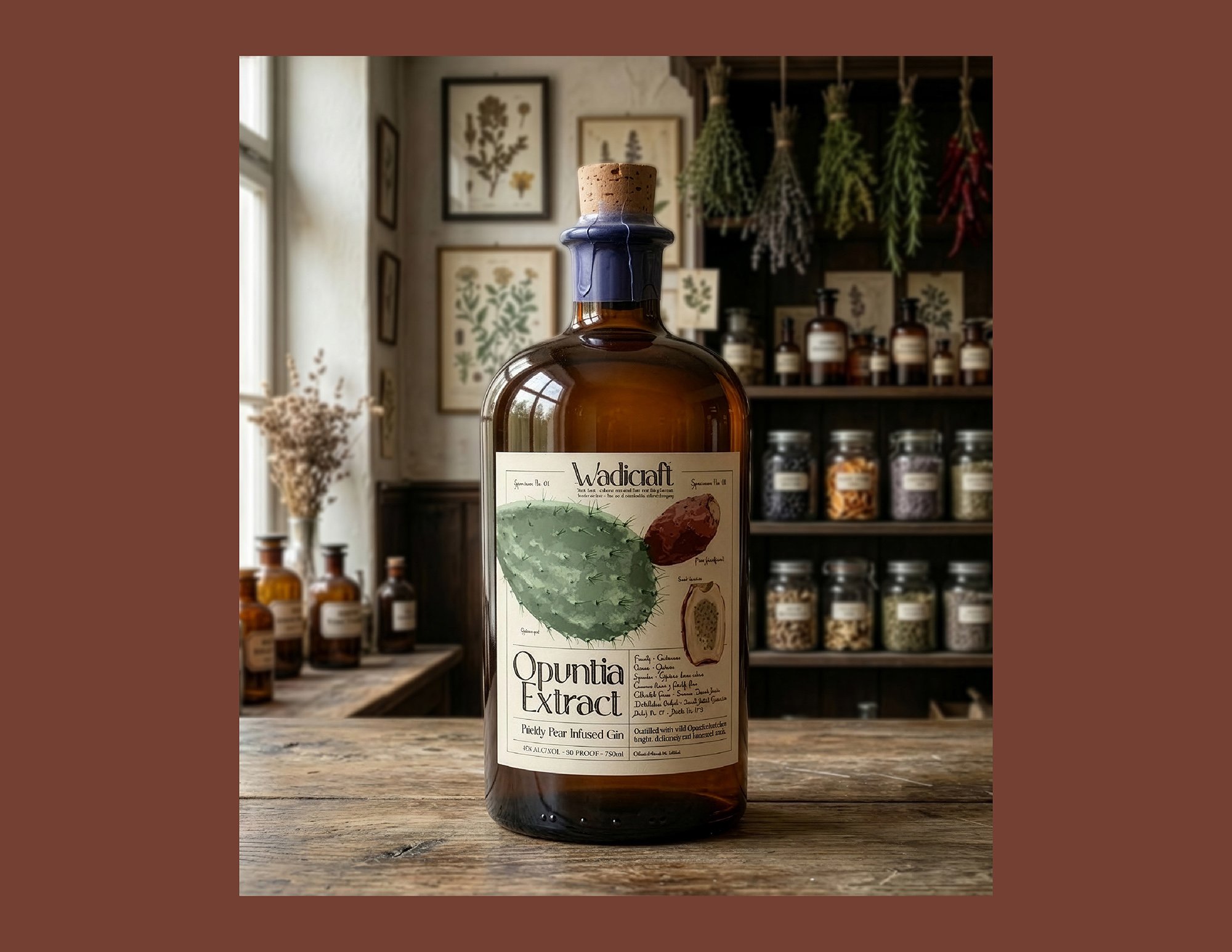
The final packaging solution for the Prickly Pear Infused Gin utilizes a sophisticated desert palette—Saguaro Green, Dusk Slate, and Antique Cream. The brand design and identity are anchored by a refined serif wordmark and a signature circular seal. The label serves as a "field-guide" for the spirit, featuring a structured grid that highlights batch numbers and technical details alongside intricate hand-drawn art, ensuring the product feels like a limited-edition collector’s item.
-
Wadicraft successfully positions itself as a story-driven player in the competitive craft spirits market. By balancing geographic pride with high-end packaging, the identity resonates with both Arizona locals and national connoisseurs. The system is fully scalable, providing a clear roadmap for future spirit releases while maintaining a professional, "shelf-ready" presence that adheres to strict TTB labeling standards.
-
This project reinforced the value of "Scientific Illustration" in luxury brand design and identity. I learned that technical details—like the batch and bottle numbers required for craft spirits—can actually enhance the premium feel of a product when integrated into a clean packaging layout. Mastering the balance between artistic botanical work and the rigid structure of TTB labeling has become a cornerstone of my approach to spirits branding.
Primary Logo: The full Wadicraft brand mark, combining a refined serif wordmark with the signature prickly pear botanical seal for a premium, heritage-driven look.
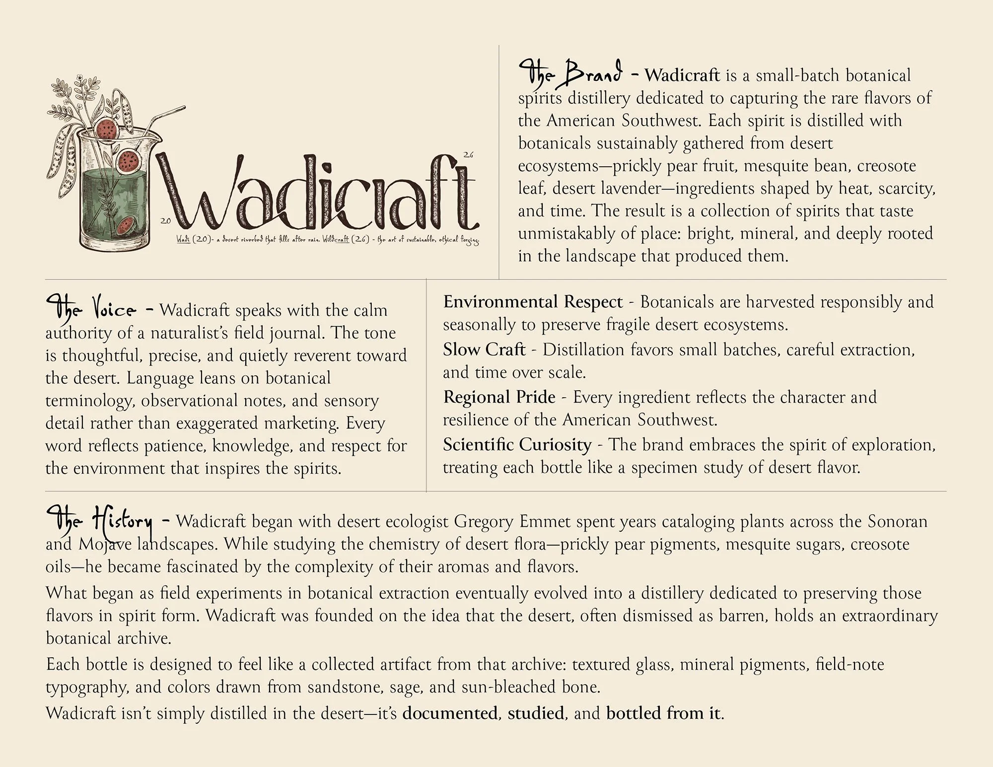
Brand Strategy & History: A comprehensive brand guidelines page outlining Wadicraft’s history, small-batch distillation values, and commitment to authentic Southwestern ingredients.

Logotype: A minimalist typographic treatment of the "Wadicraft" name, showcasing the elegant and timeless serif font used for the brand's primary identity.
Brand Icon: A custom, hand-drawn prickly pear cactus illustration, representing the brand's Sonoran Desert roots.
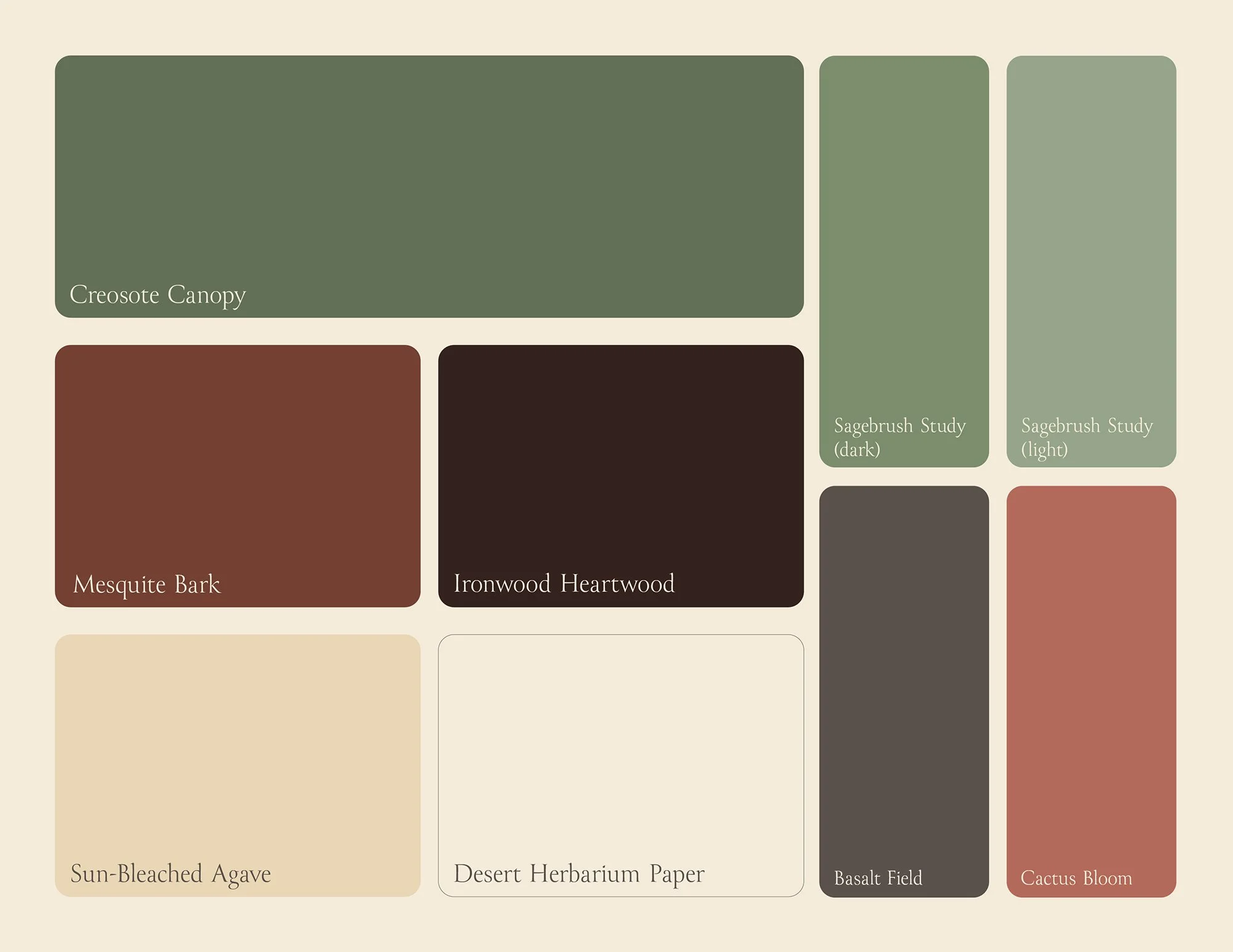
Color Palette: A landscape-inspired color system featuring colors like creosote bushes, ironwood tree bark, and cactus flower blooms designed to evoke the warmth and flora of the Arizona desert.
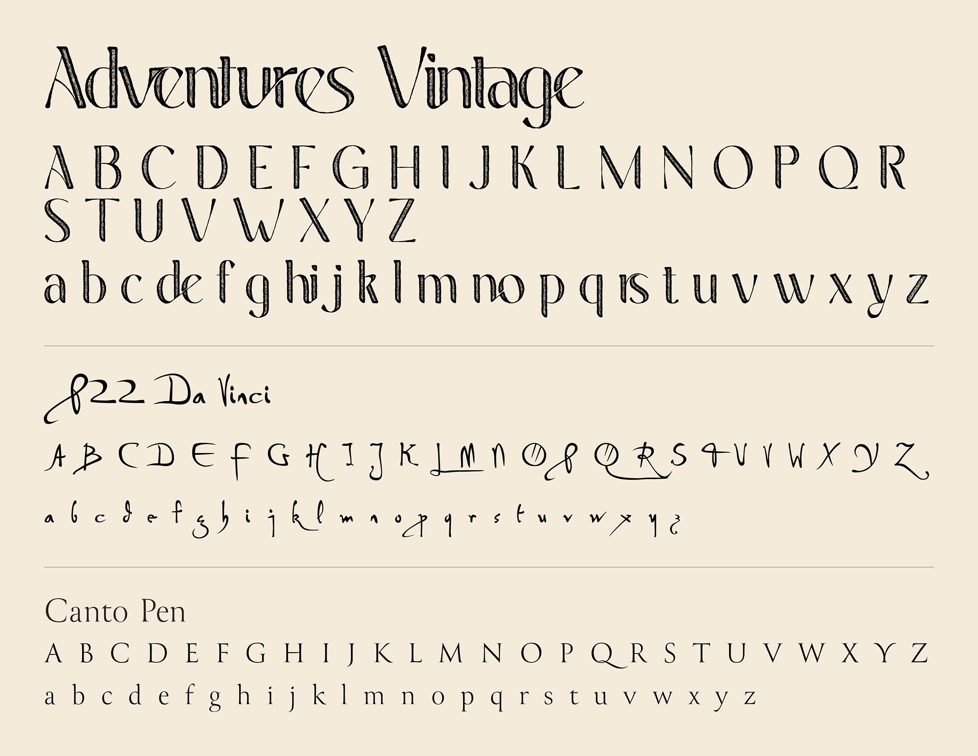
Brand Typography: The typographic hierarchy for Wadicraft, pairing the elegant Adventures Vintage serif and botanical note-inspired P22 Da Vinci with the clean Canto Pen serif for technical details and copy.
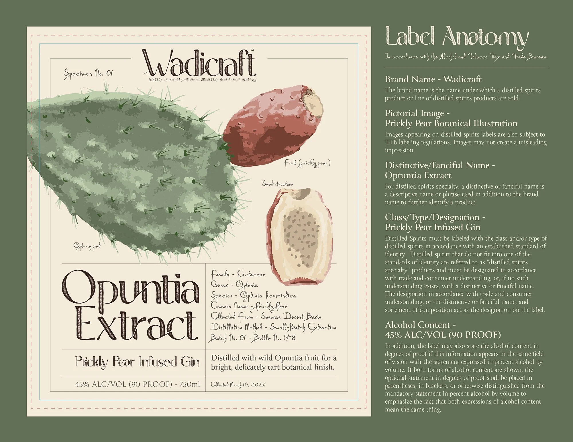
Label Design: Product label for the Prickly Pear Infused Gin, utilizing a structured apothecary-style grid, intricate botanical line art, and proof of adherence to the Alcohol and Tobacco Tax and Trade Bureau labeling guidelines.
Label Mockup: Final product packaging for the Prickly Pear Infused Gin, utilizing a structured apothecary-style grid and intricate botanical line art.
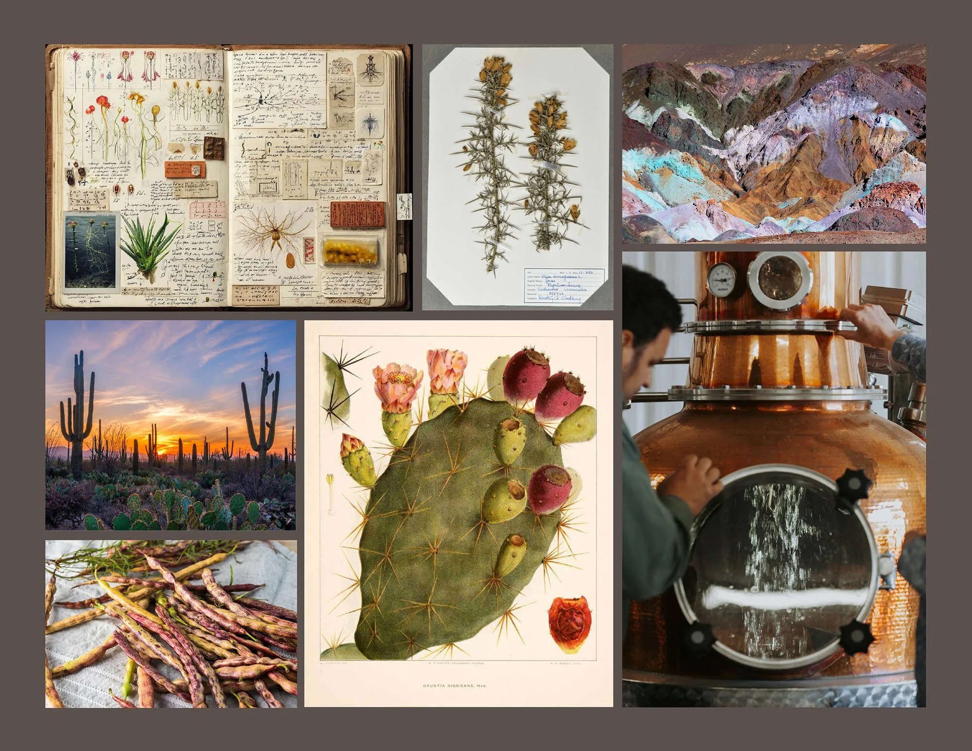
Theme Board: A library of images and illustrations to provide a bespoke, artisanal texture across all brand touchpoints.