HOA COMMUNITIES/ BRANDING & VISUAL COMMUNICATIONS
A cohesive suite of brand identities and engaging visual communications elevating the resident experience for various homeowner associations—unifying master-planned community aesthetics, vital safety information, and transparent data into accessible, beautifully designed assets.
Project type/ Branding, Graphic Design, Illustration & Layout
Date/ 2024-2025
-
Homeowner associations frequently struggle with resident engagement when communicating complex or administrative information, such as survey data, strategic plans, or facility rules. The challenge was twofold: first, developing unique, appealing visual identities that capture the distinct character of each community; and second, translating operational directives and dense data into friendly, highly visual, and easily digestible infographics that residents would actually read, understand, and appreciate.
-
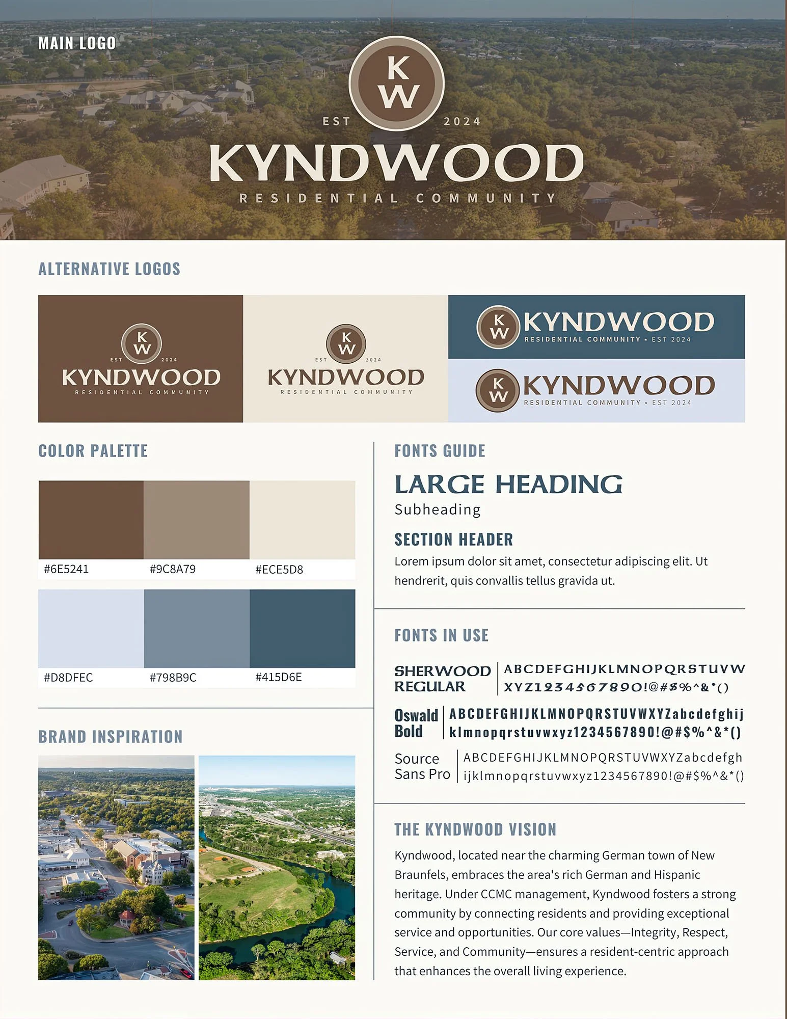
Tailored branding kits were developed to establish a professional and inviting aesthetic for each unique neighborhood. For Kyndwood, earthy tones and classic typography (Sherwood and Oswald) were chosen to reflect its rich heritage near New Braunfels. Longview utilizes a crisp, modern blue-and-gold palette anchored by a distinctive circular badge, while Stone Garden employs calming teals, taupes, and an organic grass motif. Each kit provides a unified, structured system of primary and alternative logos, exact color palettes, and typographic hierarchies to ensure consistent application across all community touchpoints.
-
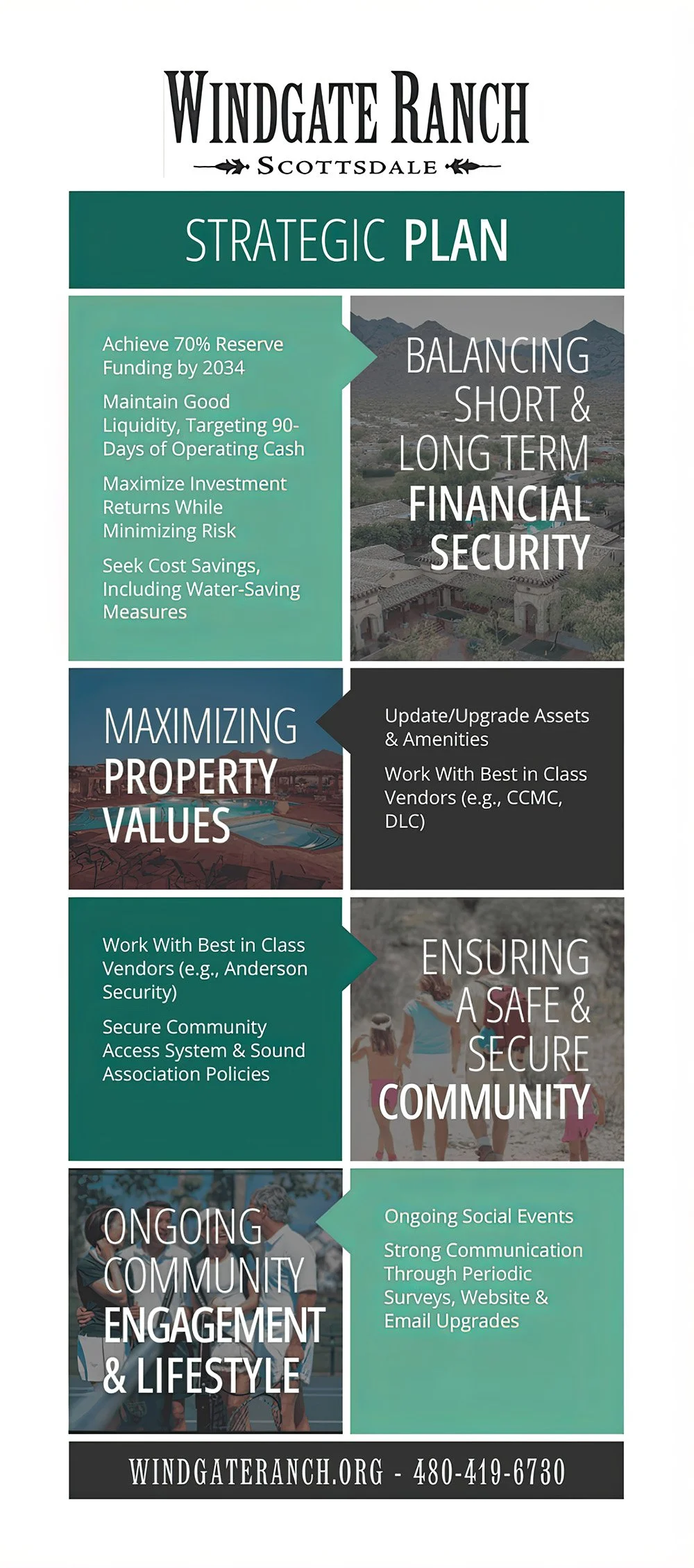
Complex community data and long-term goals were transformed into structured, visually engaging infographics. The Red Mountain Ranch 2024 Resident Survey Results utilize clear charts, bold typography, and a warm desert palette to present demographic and satisfaction data with absolute transparency. Similarly, the Windgate Ranch Strategic Plan employs a clean, color-blocked layout that pairs aspirational community photography with concise messaging. This design outlines financial, property, and community goals, making high-level HOA strategies accessible and clear to all homeowners.
-
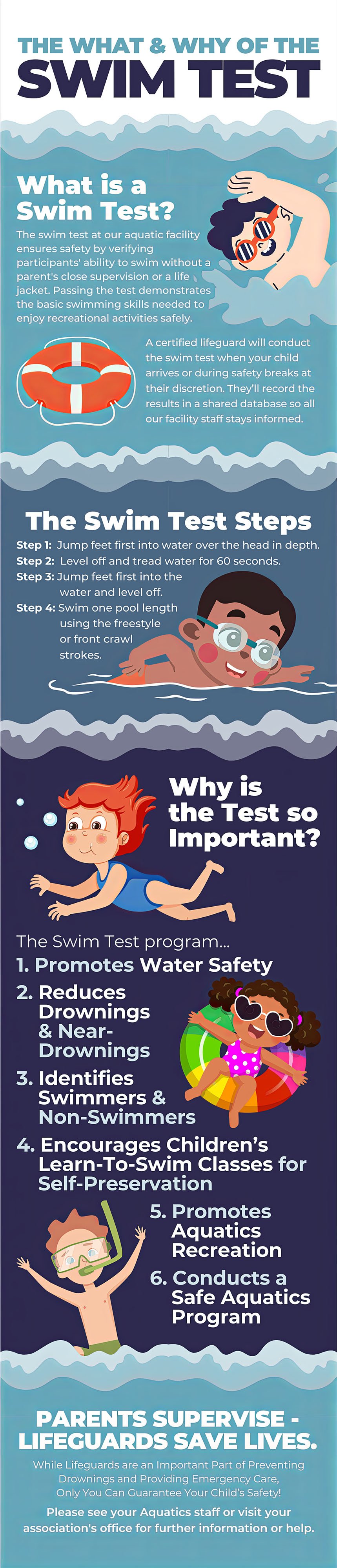
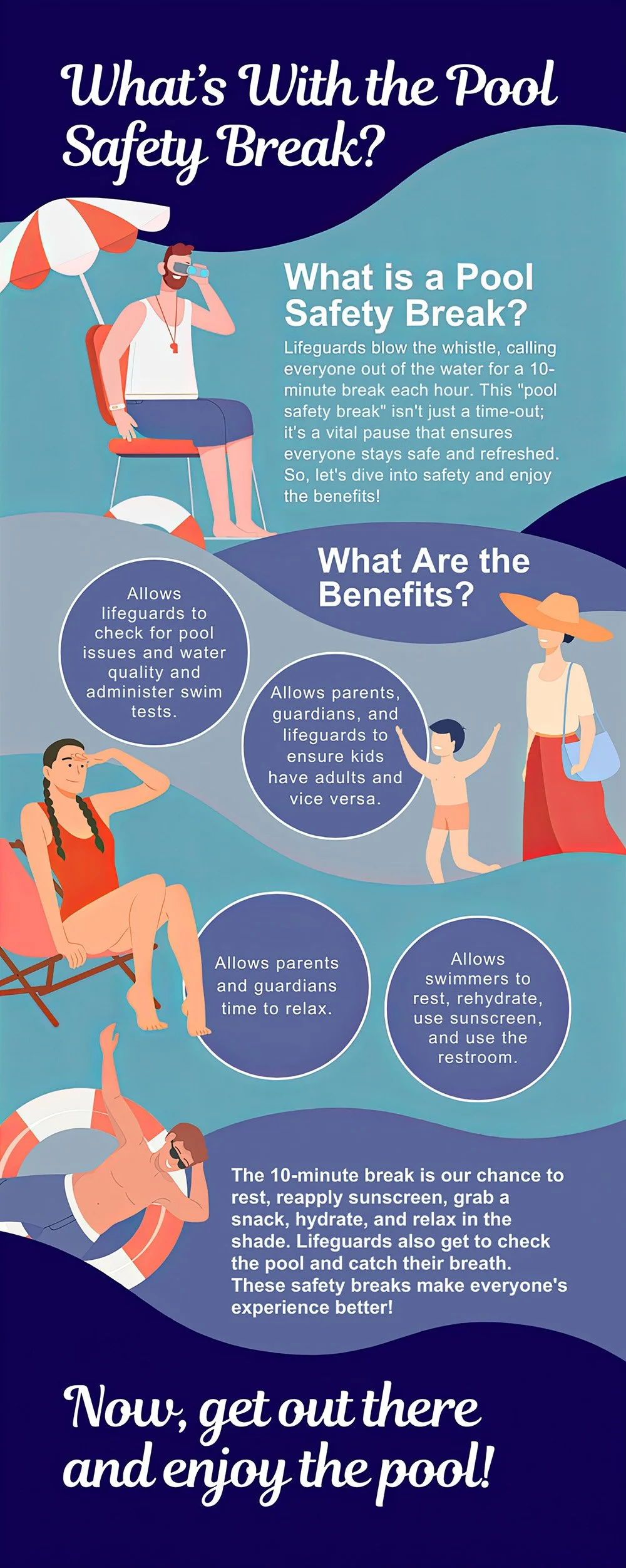
To communicate essential safety rules that are often overlooked, custom illustrations and step-by-step layouts were designed for community pools. The Pool Safety Break and Swim Test infographics use vibrant, aquatic colors, approachable character illustrations, and clear typographic hierarchy to explain the "what and why" behind safety protocols. By turning dry regulations into engaging, narrative-driven visual guides, these layouts foster a culture of safety, understanding, and cooperation among parents, children, and lifeguards.
-
The comprehensive branding and design materials successfully elevated the visual standard of these HOA communications. The distinct brand kits fostered a stronger sense of place and community pride, while the strategic infographics and illustrated safety guides significantly improved resident engagement and comprehension. By transforming standard, text-heavy HOA notices into professional, high-quality design pieces, the management teams reinforced their commitment to transparency, safety, and a premium resident experience.